Personalized!
A Powerful, Classy, and Creative way
to be joined at the hip with your favorite team
(And of course the uniforms print
will never go “out of Fashion” because a team’s uniforms are forever.)
You
can hang it, lean it, or let it lay flat.
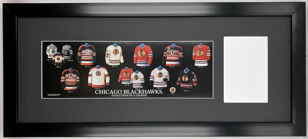
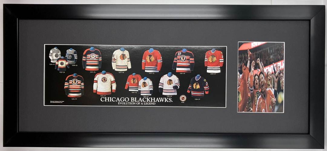
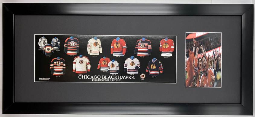
Framed Version 3
Personalized
Framed Evolution History Chicago Blackhawks Uniform Print with Your Photo: Framed with our classic, smooth black frame
with glass cover, it measures 11 3/4 inches high x 26 1/4 inches long. The cost for this custom picture is only $79 and there is a one-time $6 discount shipping cost regardless of how many you
order!
Just
add your standard 4 inch x 6 inch photo – whether it’s you in your team jersey,
or team memorabilia or something very creative, your photo possibilities are
endless because you’re only limited by your imagination.
And
you can change your photo as many times as you like!
Here are the easy steps to add your photo:
1. Use a standard 6 inch x 4 inch
photo. Keep in mind the mat will slightly overlap the photo 1/8 inch
on all four sides.
2. Turn the framed picture on its
back and bend up all the flexible tabs used to secure the picture.
3. Remove the white backing.
4. Place your photo over the mat
opening. We have marked guide lines to help you position the photo
perfectly.
5. Secure your photo on all four
sides with strips of the quality Artist’s Tape we have provided.
6. Put back the white backing and
bend back a few of the flexible tabs.
7. Look at the picture to make
sure it looks great. Then bend back the rest of the flexible tabs to
secure your framed picture. You’re Done!
We will of course include a card listing the above
steps with your order. Keep in mind you can
change your
photo as many times as you like!
And if you ever need more tape, just email us and we’ll mail you more
tape at no charge. Our email is listed
on the card.
You can also view our
how-to-do video for our “Team Up With” personalized picture (This how-to-do
video applies to all our personalized framed pictures) here:
Or you can download
our how-to-do video.
Ordering Info:

Or
(You don’t pay Sales Tax when you order from our Shopping Page.)
Click here to return to List of Teams and
Leagues
***************************************
The Chicago Blackhawks: “Evolution
Of A Legend”
The Greatest-Scapes is an
accredited business of the Better Business Bureau. We have been a member of the Better Business
Bureau since 1986—and we have an A+ rating.
For more detailed
information about The Greatest-Scapes, please click the BBB Logo at left.
Thank you
E-mail: greatestscapes@hotmail.com
Click here to return to List of Teams and
Leagues
***************************************
Here is the history of the Blackhawks’ Uniforms …
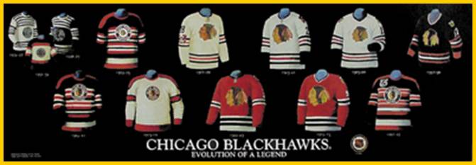
#1.
1926-27
The Western Hockey League is
disbanded after the 1925-26 season, and coffee baron Major Frederic McLaughlin
is convinced to purchase the Portland Rosebuds. A consortium headed by
McLaughlin buys the franchise for $200,000, moves the team to the Windy City
and changes the name. Supposedly, McLaughlin named the team the ‘Blackhawks’
for two reasons: he was an ex-military commander, who belonged to the 85th
Blackhawk Division in World War I…and a ‘Chief Blackhawk’ was the leader of an
Indian tribe in the Midwest. The Blackhawks, using the Chicago Coliseum as
their home, readied to begin NHL play for the 1926-27 season – as one of 10
teams. Led by such ex-Portland personnel as Dick Irvin, Sr. (who would later
coach), Rabbit McVeigh, and Percy Traub and joined by newcomer Babe Dye – the
Blackhawks finished their inaugural season a respectable 19-22-3 for 3rd
in the ‘American Division’. Note the
unique, 2 colour, striped uniforms the Blackhawks used for the better part of
their 1st decade (they were 1 of 3 teams to use a 2-colour scheme –
Toronto & Detroit being the others!) Also note the ‘Chief Blackhawk’ logo
on the chest – an icon the team still uses to this day!
1928-29 This jersey is the same as
the previous one with the colours reversed. The early to mid-30’s were an
bittersweet period for the franchise – punctuated by the following ups &
downs: by 1932-33, the team was playing their games at the fabled Chicago
Stadium…the 1933-34 season saw the Blackhawks win their 1st Stanley
Cup only to lose their star goaltender, Charlie Gardiner to a brain hemorrhage
2 months later.
1935-36 By the 1935-36 season, the
team’s uniform was converted to the more recognizable 3-colour scheme of black,
red & white – but the team, minus Gardiner, was not considered a Cup
contender. McLaughlin, challenging Canada’s ‘grip’ on hockey, decides to build
an all-American Blackhawks squad – and actually wins the Stanley Cup in the
1937-38 season – defeating the heavy favourite Maple Leafs!
#2.
1946-47 This jersey, synonymous with Chicago greats such as the
Bentley Brothers (Max & Doug), and Bill Mosienko is showcased for the
highly unusual striping pattern on the sleeves and body of the jersey! You’ll also
notice that ‘Chief Blackhawk’ is also now in full colour. Keep an eye on this
fellow…he undergoes many subtle changes throughout Chicago’s history. For you
Blackhawks’ trivia buffs: did you know that the team’s nickname was usually
written as two words – Black Hawks – right up until the 1985-86 season?
#3.
1952-53 Note the smaller version of ‘Chief Blackhawk’ on the 1952-53
jersey! How about the red ‘yoke’ on the shoulders – something the team had
early on in their history, but would eventually drop by the 50’s. Look closely
between the 46-47 and 52-53 versions and you’ll notice the font change in the
circular logo – the 52-53 sweater features a serif font. An interesting
side-bar note…in 1951-52, the NHL ruled that home teams were to wear white jerseys,
and away teams – dark…staying this way until the 1954-55 season, when the
league would reverse this rule, having the home team wear dark or coloured
uniforms. Thus, the 52-53 jersey showcased here is the Blackhawks’ ROAD
sweater.
#4.
1953-54 This HOME jersey, as worn by top 10 scoring leader Jim
McFadden, is very clean & elegant! Notice the fact that the striping
pattern has been simplified from the 46-47 and 52-53 versions. For the 1954-55
season, the NHL imposed a rule change stating home teams were to wear DARK or
coloured uniforms with visitors wearing white or light. The jersey scheme would
stay this way right up until the 1970-71 season.
#5.
1957-58 This is a great looking sweater, synonymous with Glenn Hall,
and symbolizing a very trying time for the Blackhawks. The 50’s saw Chicago
finish in the mid to lower echelon of the league. By this time, perennial top
10 scoring leader Ted Lindsay is involved in the infamous deal – sending him
from the Red Wings to the Blackhawks and watching his point totals decrease
dramatically. Lindsay would never again finish in the top 10. On positive
notes, 1957-58 marked the rookie season of budding superstar – Bobby Hull – who
would help the Blackhawks surge again! Glenn Hall is also amidst his record
setting string of consecutive complete games by a goaltender – which finished
at an incredible 502 games! There are many interesting features of the 57-58
sweater: note the laced collar, the fact that ‘Chief Blackhawk’ is much larger
(and without the traditional circle and text!), the presence of the iconic
tomahawks / ‘c’ design on the sleeves, and finally, numbers now exist directly
above the tomahawks!
#6.
1962-63 Led by all-stars Bobby Hull and Stan Mikita, the Blackhawks
win the Stanley Cup once more in 1960-61 – helping erase the taste of a
mediocre to poor 50’s decade for the franchise. The HOME jersey showcased here
is similar in design to future ROAD jerseys well into the future (in 1970-71
the NHL would rule that home teams wear light or white jerseys!). Notice the
facelift ‘Chief Blackhawk’ has undergone since the 1957-58 jersey!
#7.
1963-64 Boasting 3 players in the league’s top 10 scoring (Mikita,
Hull - who finish 1-2 & Kenny
Wharam), the Blackhawks finish 2nd in the regular season, only 1
point behind the Canadiens! This sweater, as worn by Chicago rookie Phil
Esposito, showcases some great changes from the 1957-58 version. The crossed
tomahawks and ‘c’ have been shifted away from the sleeve stripes to the
shoulders. Notice the thick, black cuffs on the base of the sleeves. The end of
the Original Six era is drawing near (the NHL would expand for the 1967-68
season)…gone will be the days where 4 out of 6 teams would be strong enough to
contend for the Stanley Cup! The mid 60’s were also notorious for Hull, Mikita
and ‘Boom Boom’ Geoffrion introducing ridiculously exaggerated (banana) curved
stick blades – whereas most NHL’s used straight blades.
#8.
1972-73 Led by such greats as Jim Pappin and Tony Esposito, Billy
Reay’s Blackhawks win the West Division only to lose in the Stanley Cup final –
bowing out to Scotty Bowman’s Canadiens 4 games to 2. This marks the 2nd
time in the early 70’s that the Canadiens edge out the Blackhawks for the Cup!
Sadly, for die-hard Chicago fans, the WHA has lured superstar Bobby Hull away
for $1 million…one can only imagine the Cup outcome if Hull were still a
Blackhawk! Note the collar on this year’s sweater – by this time, the laces had
been removed, and it’s now striped.
#9.
1983-84 The NHL is now a 21-team league
and find the Blackhawks nestled in the Norris Division. This jersey, synonymous
with the Denis Savard & Steve Larmer era, is actually very similar to the
1963-64 version – note the alterations to ‘Chief Blackhawk’ from past years!
#10.
1991-92 The NHL celebrates its 75th
anniversary! All Original Six teams wear ‘throwback’ jerseys to honour the
occasion – with all franchises wearing the commemorative patch on the right
shoulder. This jersey, as worn by Jeremy Roenick & Chris Chelios, pays
homage to the style worn in the late 40’s and early 50’s. The Blackhawks of the
late 80’s & early 90’s were often at or near the top of the Norris
division…the 91-92 season would see them bow out to the Mario Lemieux-led
Penguins in the Cup final 4-0.
#11.
1997-98 The Blackhawks say goodbye to their beloved Chicago Stadium
in 1994 – the United Centre across the street is the new mailing address. By
this time, many NHL franchises have introduced 3rd jerseys (with the
exception of a few clubs such as the Canadiens & Red Wings!)…the Blachawks
version is showcased here. Fans had a real appetite for these new
incarnations…originally whetted by the ‘throwback’ jerseys worn in the 1991-92
season. And the Blackhawks and their fans say hello to … 2010 STANLEY CUP
CHAMPIONS!!!